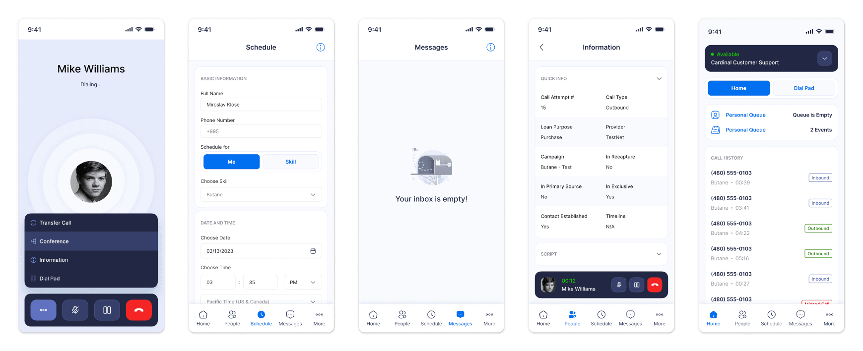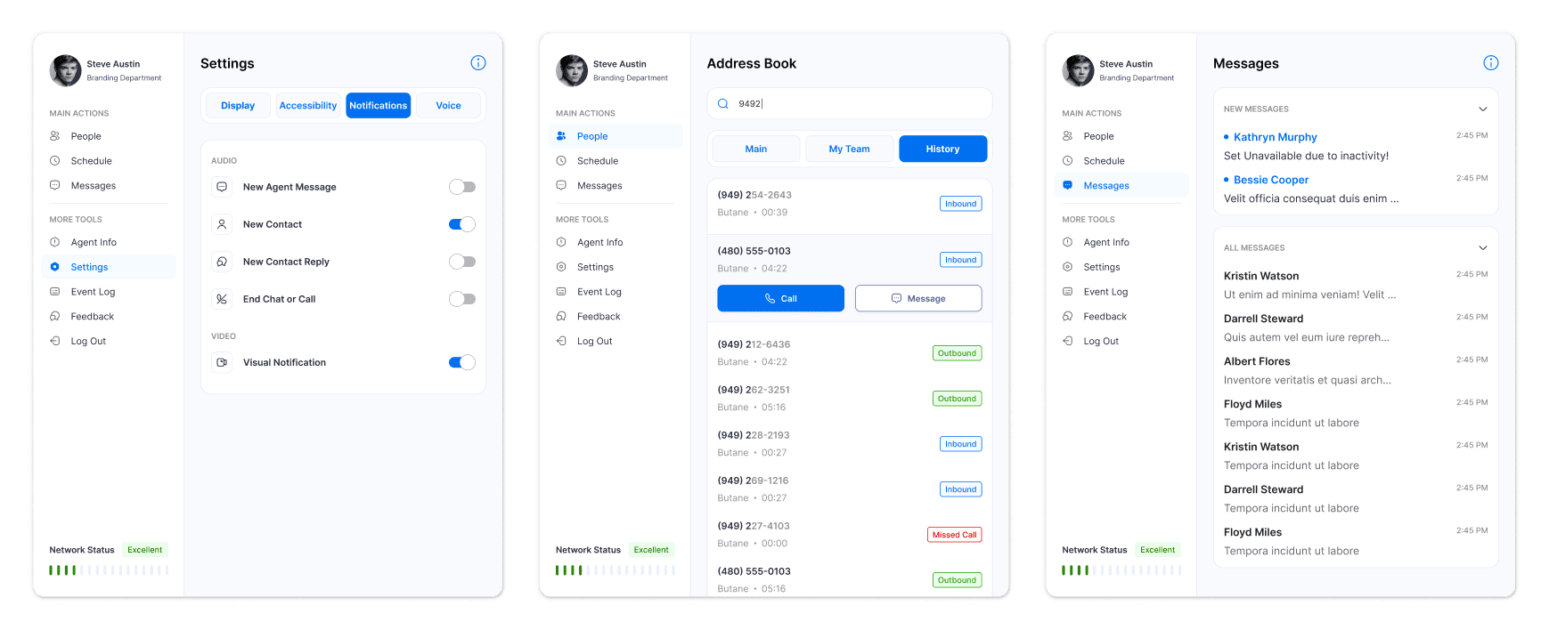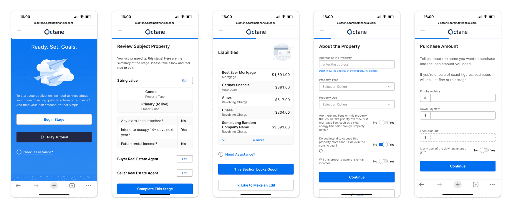
Multi-channel Mortgage Company
with 3 Product Designers, 4 Front-end Engineers, and 3 Product Managers
Overview
I was brought in to build an internal design system from scratch and function as a UX consultant across product teams. Through a structured approach grounded in accessibility, atomic design principles, and collaborative design ops, we built a WCAG 2.1-compliant, tokenized system in Figma.
By early 2024, the Kinetic design system was implemented across four products and three brands. It enabled faster feature development, improved handoff efficiency, and made rebranding dramatically simpler. The design team scaled with confidence, and engineering velocity improved with standardized component integration.
Context
Business Goal
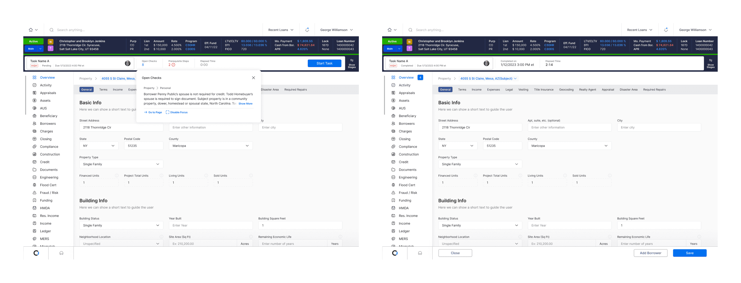
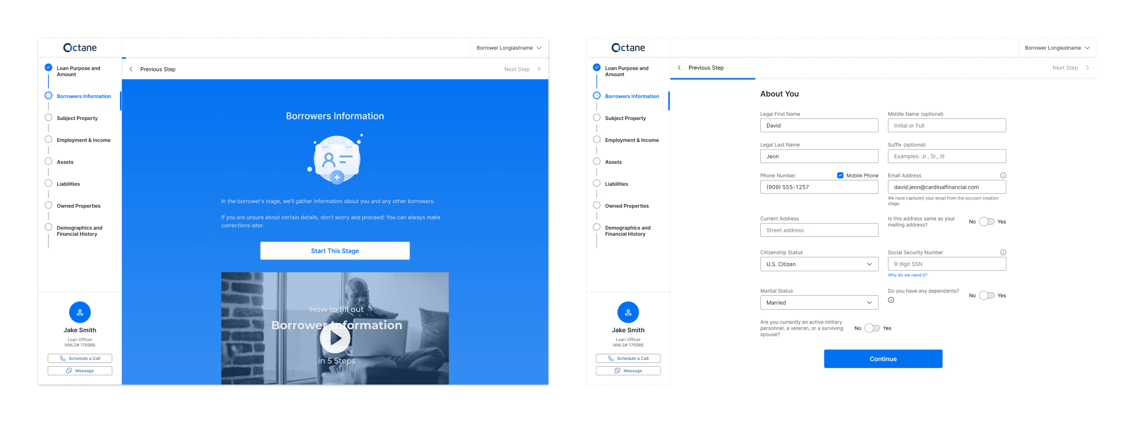
Cardinal Financial’s proprietary Loan Origination System (LOS) was originally built for internal mortgage brokers and employees. As the company evolved its strategy to offer the platform as a white-label SaaS product for external lenders and correspondent partners, design flexibility and accessibility became essential.
Tech Debt
While the platform was functionally powerful, it lacked the design infrastructure needed for multi-brand theming, regulatory compliance, and developer efficiency.
A newly delivered UI from an outsourced team showed strong visual direction, but it wasn’t built to support the complexity of financial workflows or ensure accessibility — both critical for a product operating in a regulated space.
My role was to take that foundation and evolve it into a scalable, well-governed design system — without starting over from scratch.
A Design System to
Planning
Accessibility
While the outsourced team had delivered polished UIs, they fell short of WCAG standards — particularly around color contrast. I created a accessibility checklist and standard method to create accessible color palettes.
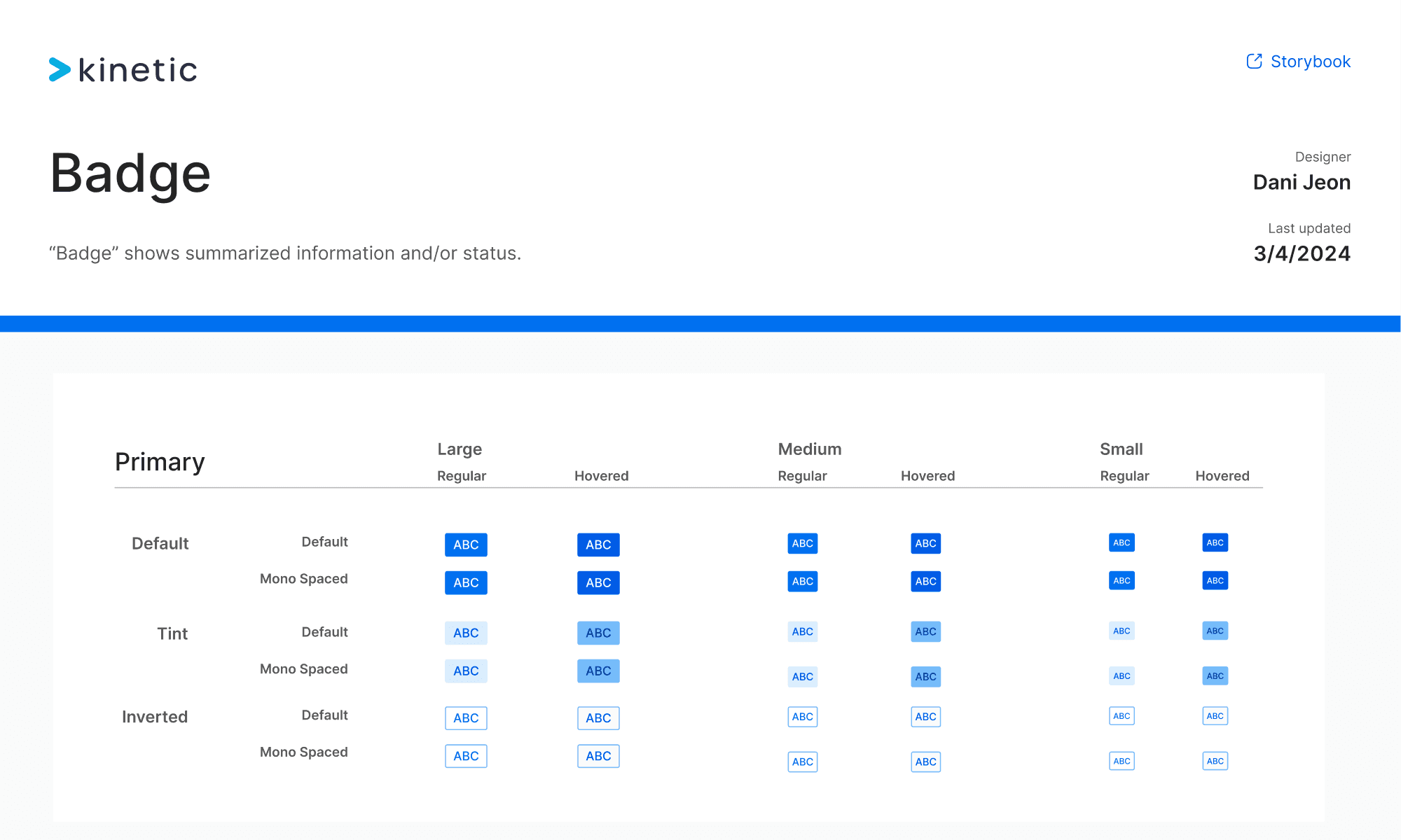
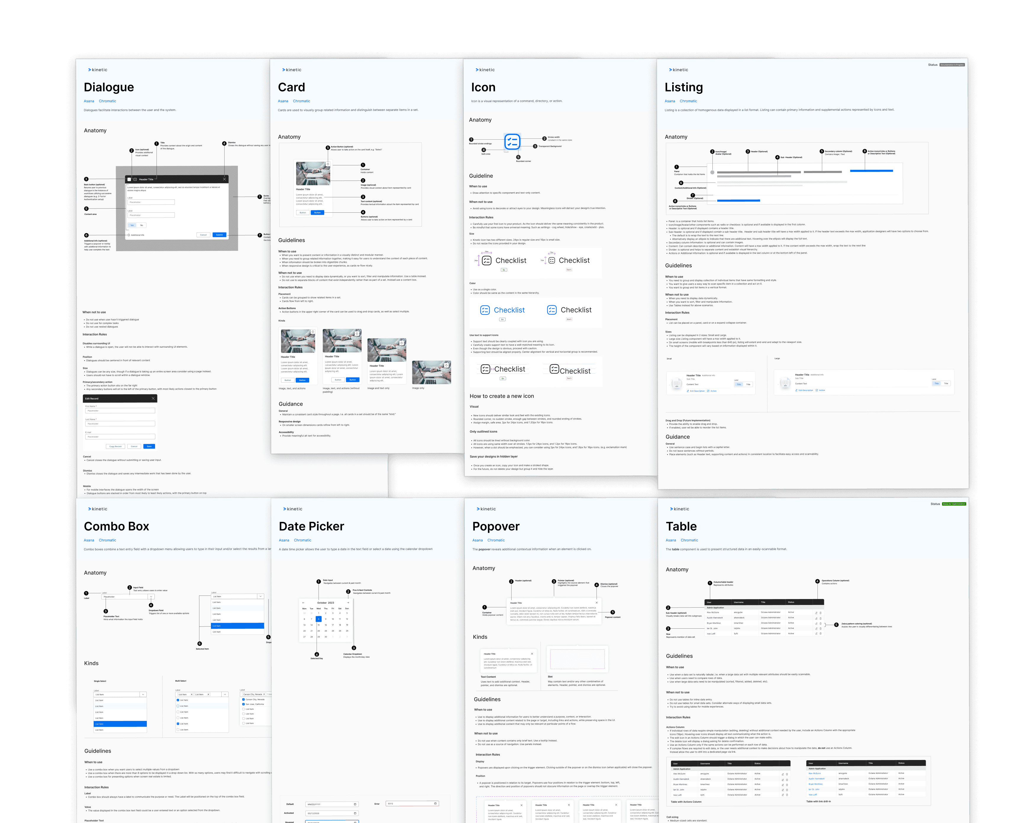
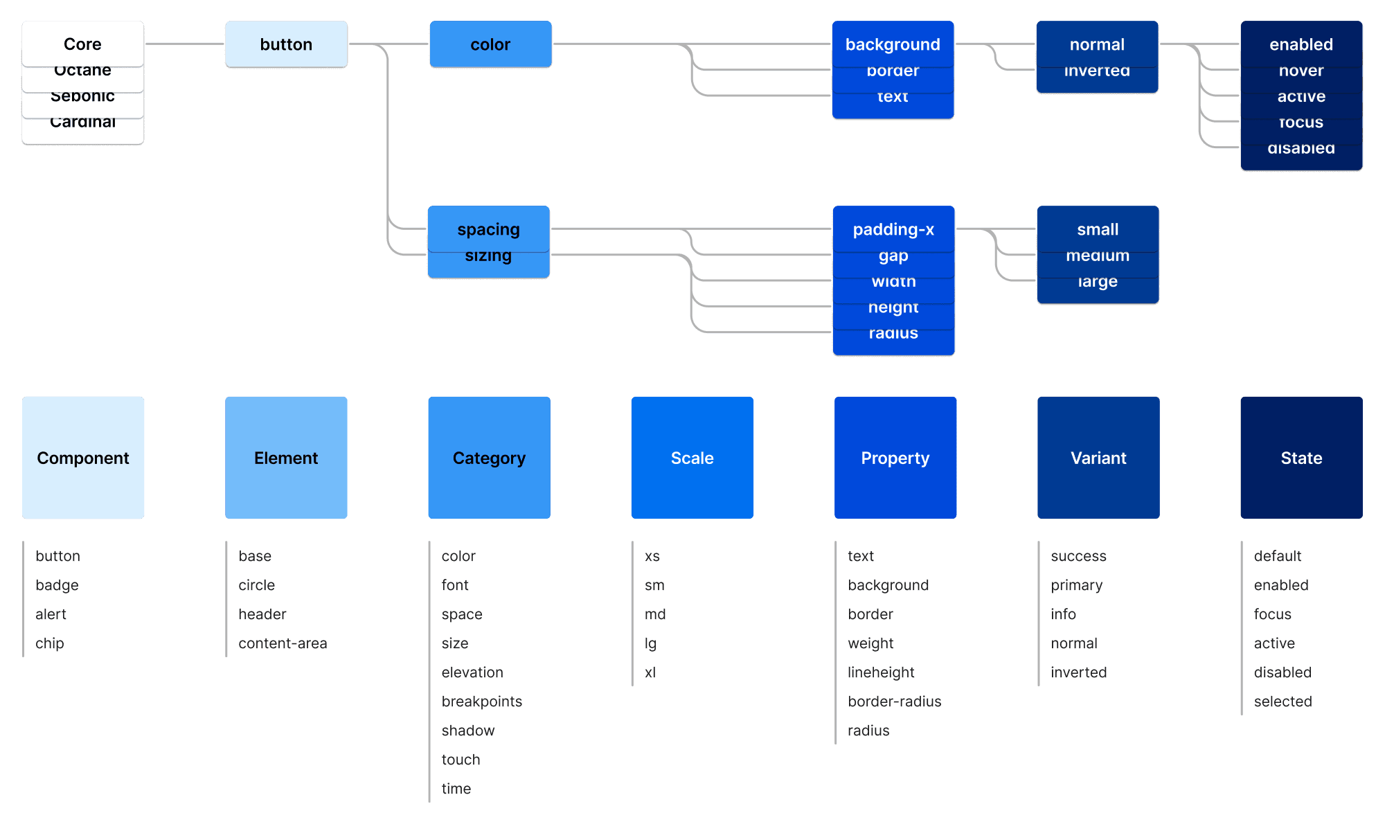
Atomic Design & Token Structure
We mapped out components using atomic design principles to ensure reusability and ease of maintenance.
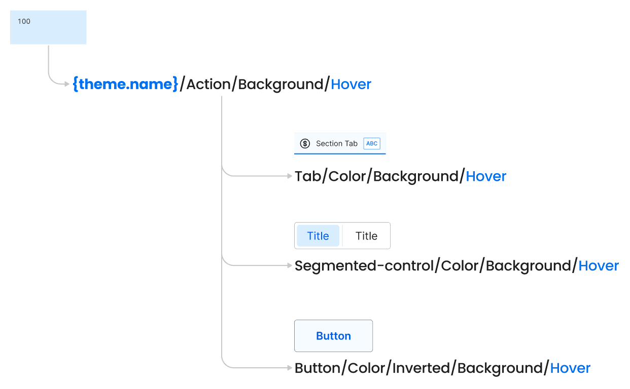
Since token management in Figma was limited at the time, we agreed with engineering to treat the codebase as the single source of truth.
We established token hierarchies, naming conventions, and component token mappings to support future scalability.
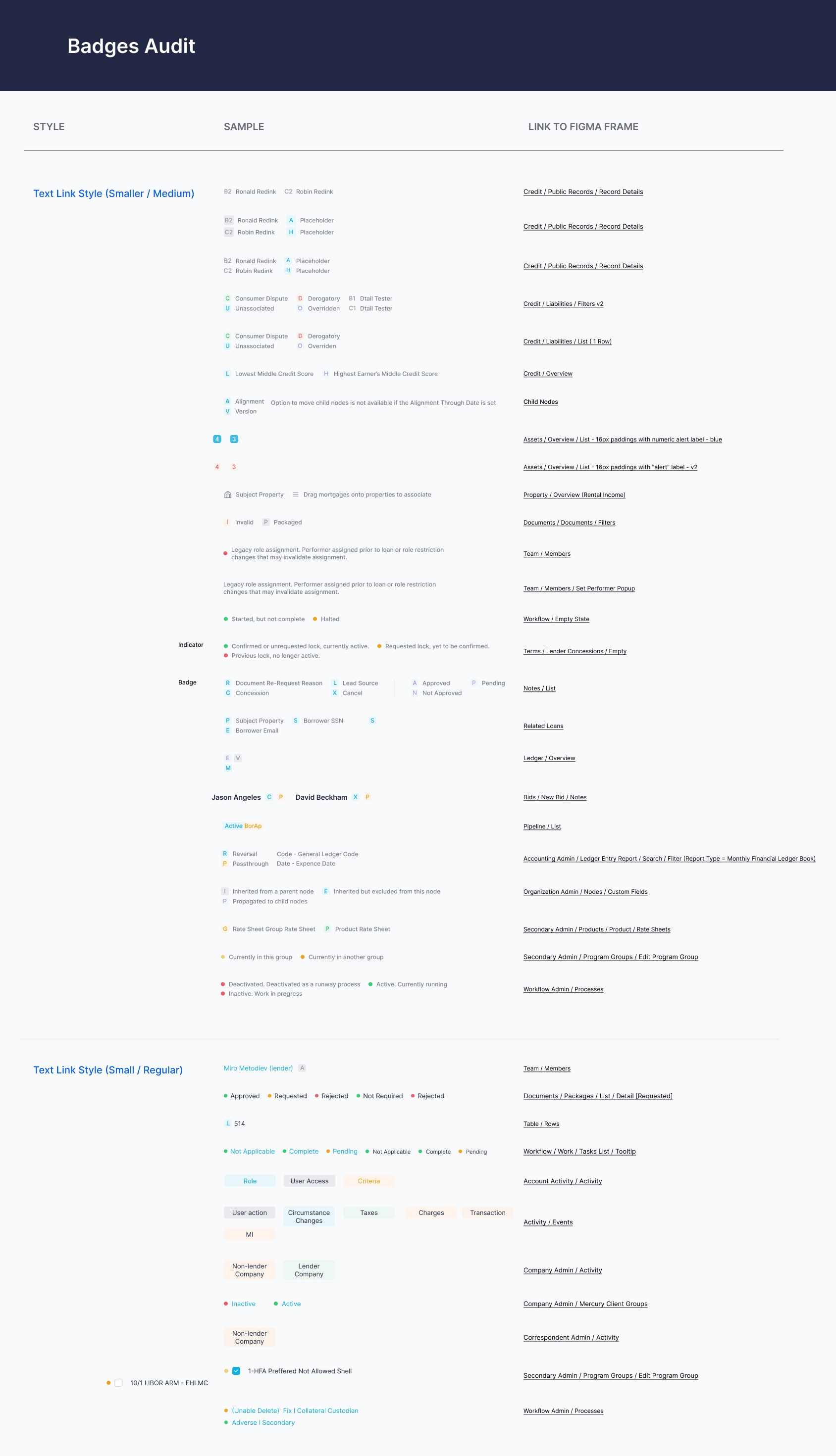
Design Audit
To prepare for systemization, we audited the existing product and designs for repeated patterns and edge-case UI variations.
We planned the audit-design process and initial components and features to be audited.
Design Ops & File Governance
I planned & restructured our Figma files for clarity and access.
All feature design files linked directly to the Kinetic library. Each file included Asana task thumbnails for status visibility, and updates flowed from feature branches back into the main system file.

Execution
1. Design Audits
We conducted collaborative audits where designers listed and categorized existing UI patterns, then held working sessions to align on naming, behavior, and usage.
2. Component Creation & Reviews
Each designer branched the system file to build new components. Once complete, we reviewed together as a team, then merged approved components into the main branch. Documentation was created based on reviewer notes and component decisions.
3. System Updates in Figma
Published components were integrated into feature design files only after full-page replacements were possible. This avoided hybrid states and ensured consistency from the start.
4. Engineering Handoff
Before Figma’s Dev Mode, we used Zeplin for specs, Loom/Other Videos for context, and Storybook for review. We tightly aligned design and development by ensuring every component in Figma matched coded equivalents.